

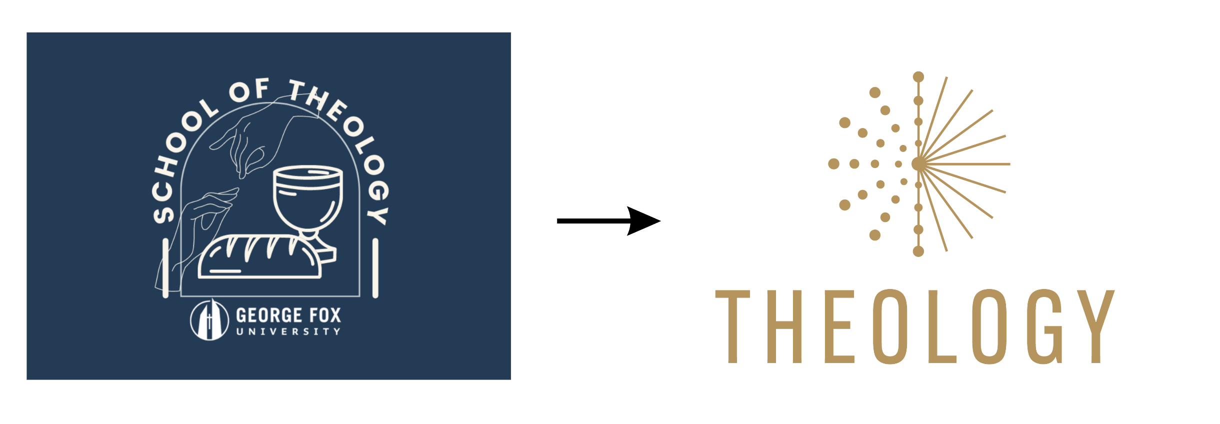
Re-branding // School of Theology
ORIGINAL LOGO
UPDATED LOGO

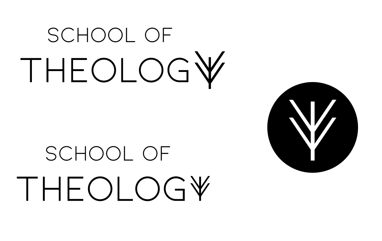
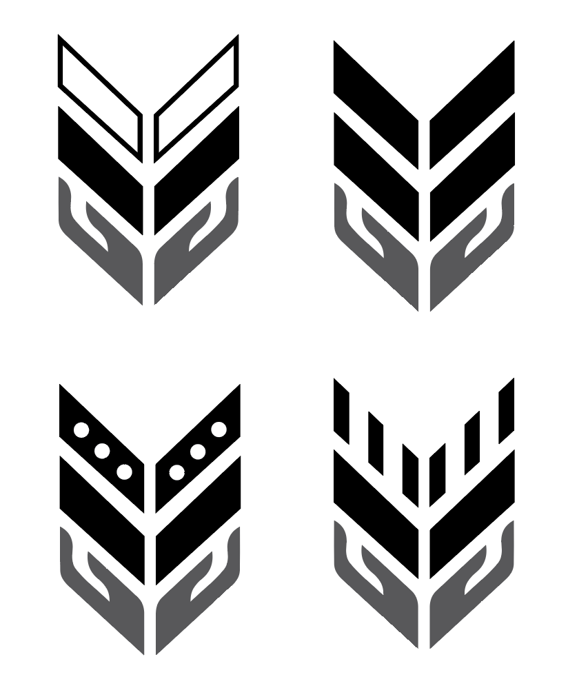
Digital Concepts


Final Designs
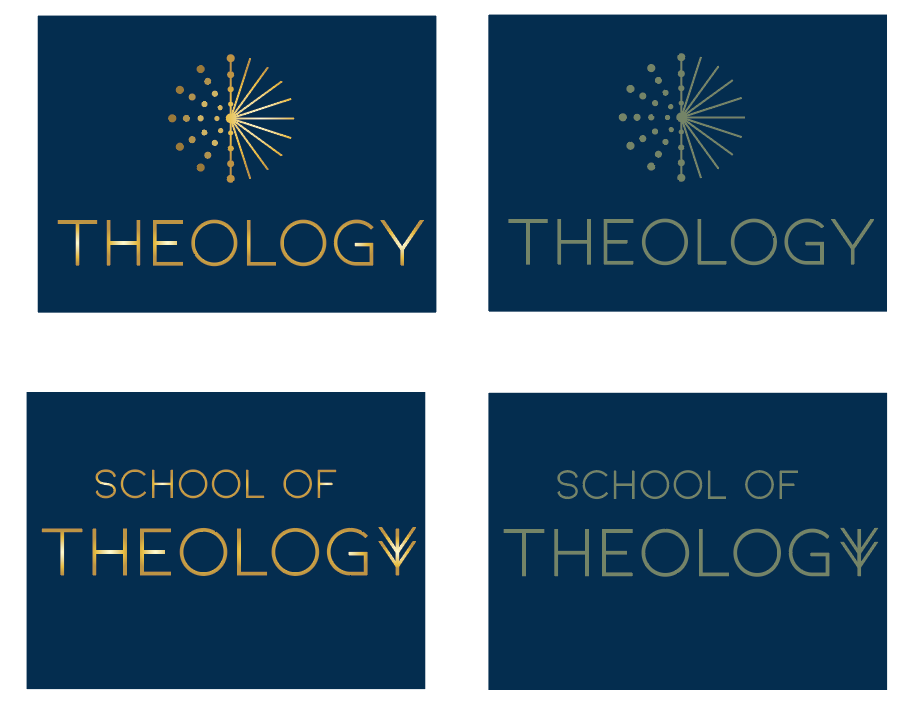
Salt and Light
“You are the salt of the earth... You are the light of the world..." Matthew 5:13-16
The circles on the left symbolize salt, and the lines on the right are light.
Pages of a Book
When thinking about the School of Theology, a book was one of the most commonly brought up symbols that came to people's minds. The lines on the right side are also meant to depict an open book with the pages flipping.
Colors

The color palette is designed to depict a sophisticated gold organization. Gold holds an immense amount of biblical symbolism, including the indication of the acquisition of knowledge, wisdom, and faith as well as its enduring properties through fire. There are 3 primary colors that should always be used to maintain brand consistency. Secondary gray colors may be used in combination with the primary. Everything together creates a modern, elegant look.
Typography


