

Kids Snack Brand
Overview.
For this project, I was tasked with creating a logo and illustrating design elements for a kid's snack package product. The goal was to focus on choices of material and form as well as graphics, colors, and fonts used on wrapping a box, can, bottle, bag, or any type of container. The audience consists of parents of young children or grandparents who are looking for the best snack options for their kids.

Final Design

Ideation + Process

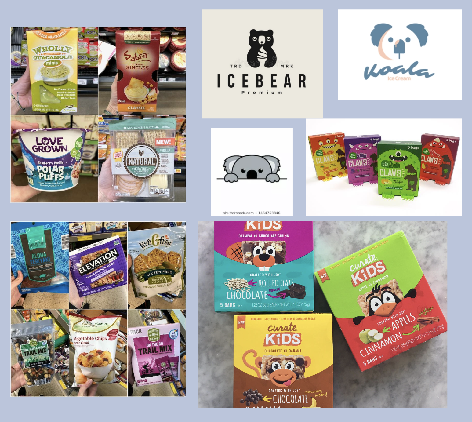
I began by brainstorming as many ideas as I possibly could for kids’ snack product ideas as well as potential brand names. I also interviewed my mom and two of my older siblings and their families about what they felt was important when it came to purchasing snacks for their children. With all of that information, I had an idea of a color palette to pursue and I knew that I wanted my brand/logo to revolve around something to do with animals. Koalas are fun creatures that aren't as commonly seen in food products which is why I chose to use them.


“I’d stay away from green as a color in general as most kids associate green with vegetables - I’d stick with red, yellow, orange, purple, even blue... Yes, lil’ cute monsters, or animal shapes. Most kids like cheese & fruit. Maybe fruit leather cut in animal or monster shapes (now they’re all boring strips), or cheese in individual packages cut into the same type of shapes.”
“We’re trying to cover a lot of of different foods (just 1 at a time) so he doesn’t get super picky early on.”
“We always try to look for keywords like fresh, organic, whole grain, etc.”
“I look for things with simple ingredients. Especially since we’re just now introducing foods to Liam, I want to make sure there isn’t a lot of different flavors mixing together in case he’s allergic to anything.”
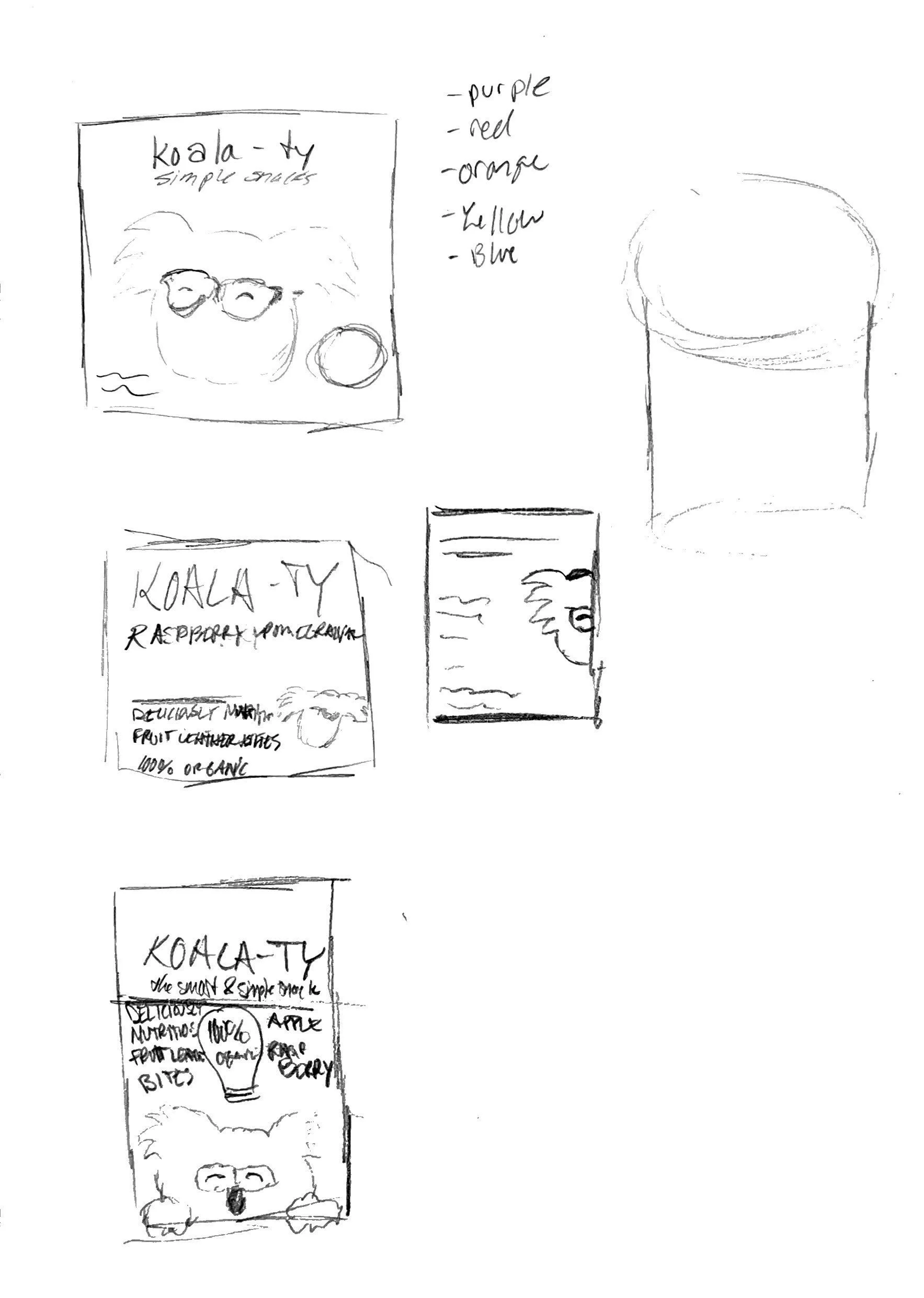
Rough Drafts
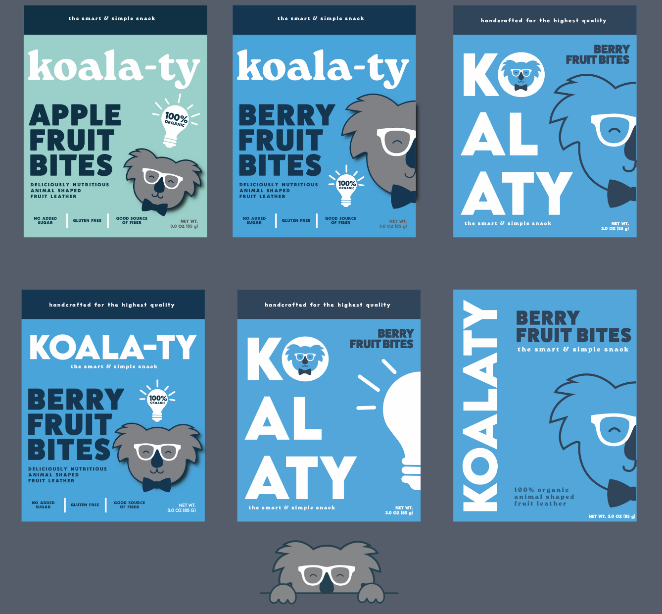
I have a love for puns, so I wanted to take my brand name idea of Koala-ty (quality) and run with it. My illustrating skills are always a work in progress, but I did my best to create a fun koala named "Theo" that not only is appealing to kids but portrays symbols like the glasses and bowtie that convey how this is a smart brand. I chose to use three different fonts, "Lemon Milk" for the logo, FatFrank Heavy for the flavor title, and Roca One Heavy for everything else. The combination of these as well as the unique arrangement of the typography depicts a more modern, yet friendly design. I played around a lot with color and various arrangments during my drafts until I felt satisfied with my work.