Book Cover Design
Overview
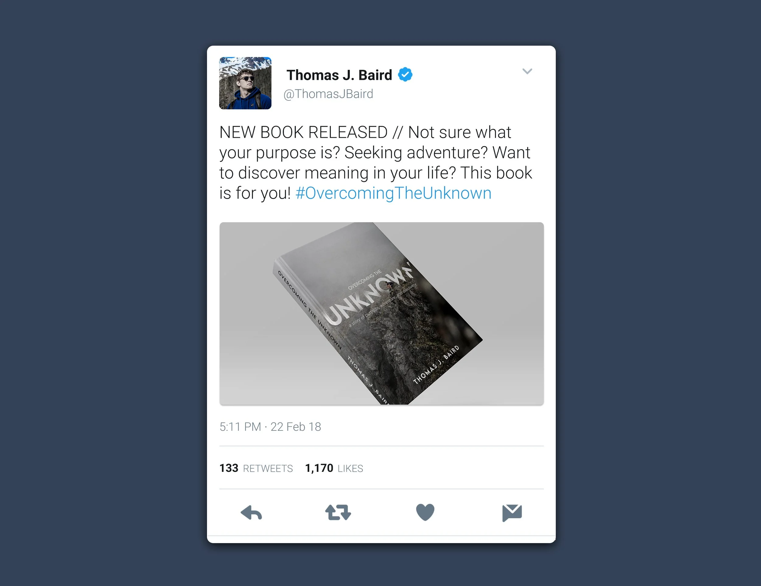
This project was aimed at creating a physical book cover, a digital version of the cover, and an ad campaign to promote the book to explore what this type of design might look like. I chose to push myself by coming up with my own book title idea based on a photo of mine, and on my brother. The audience consists of people looking to live an adventurous life and who are seeking purpose and meaning. It would focus on my brother's personal life experience and the lessons he's learned/advice and direction he would give.
Design Process.
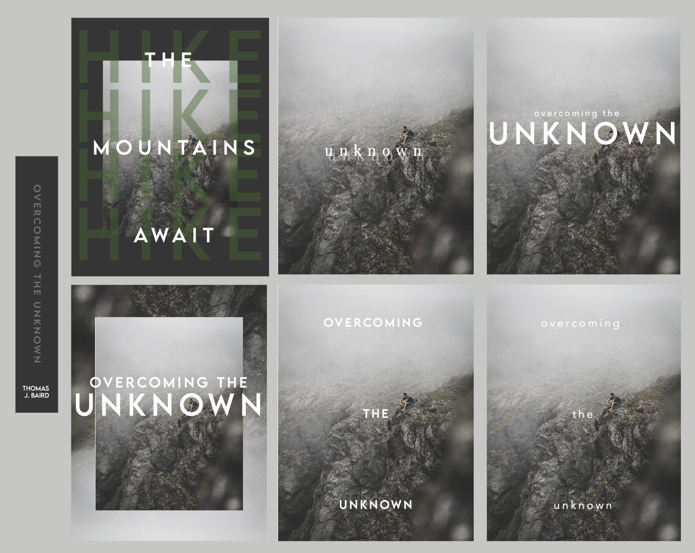
I started out by brainstorming multiple ideas of books I could redesign, and also coming up with some original ideas. I quickly realized that I was more interested in doing something of my own, and am often inspired by photography, so I pursued ideas revolving around photos I've taken. I wanted a cover that wasn't too busy, and where the text was integrated with the photo.

Rough Drafts
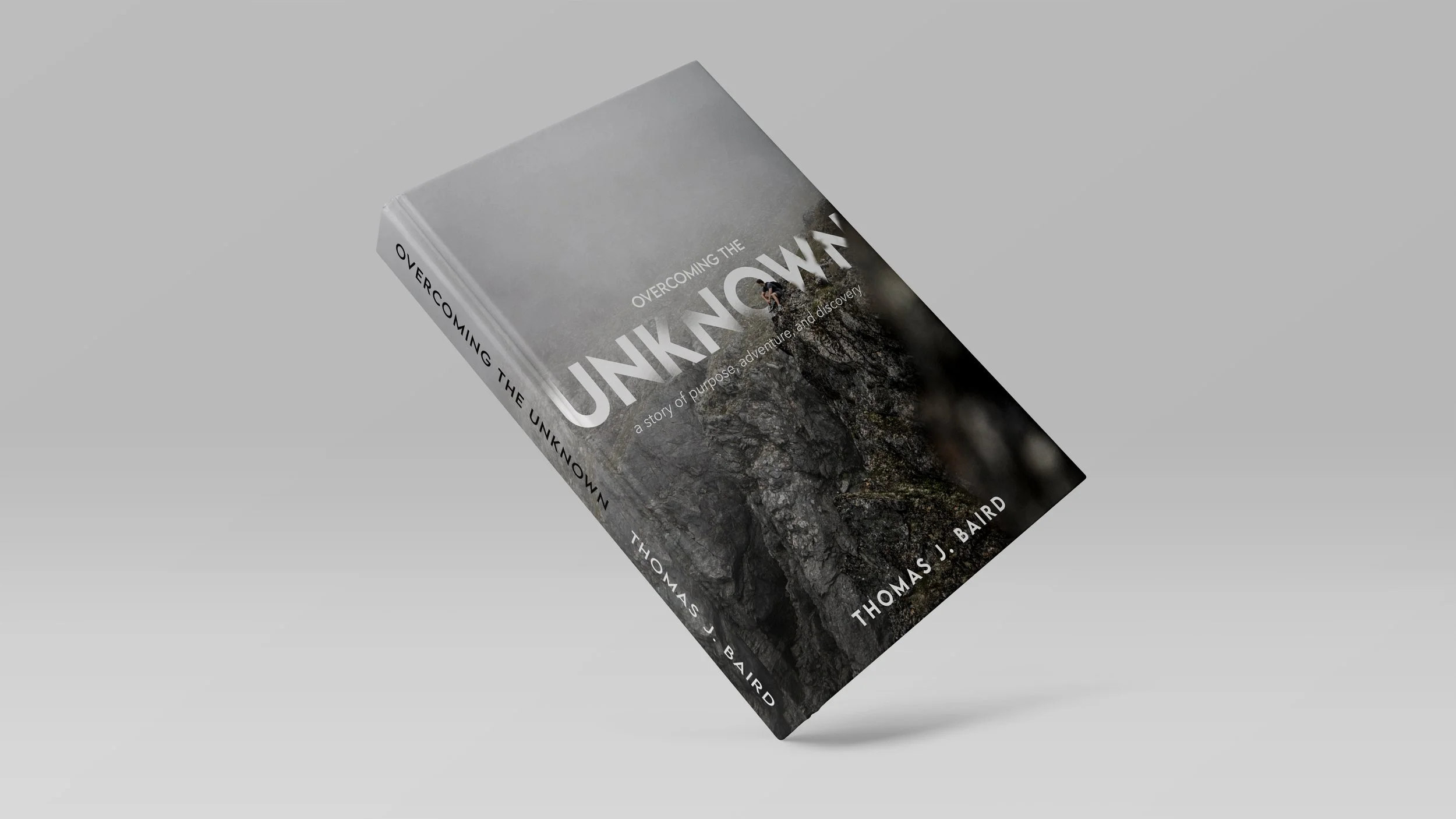
I was inspired by various book covers, which resulted in a multitude of drafts. I loved the Lemon Milk typeface that I used for the title because it is very modern and communicates simplicity, yet the sharp points are effective in catching the attention of the viewer. I wanted the viewer's eye to really be drawn to the subject sitting on the cliff, so I didn't want too busy of a design and kept the colors extremely neutral. I think this helps communicate the nonfiction aspect of the book as well as the overall content which is very straightforward. Also, the author's name is fictional and was inspired by my family history.
Final Version